

In the ever-evolving landscape of web design, the top trending hotel websites of 2024 are setting new benchmarks in user experience, creativity, and functionality. These websites are not just online brochures; they are immersive digital experiences that reflect the ethos and personality of the hotels they represent.
In order to explore what works and what doesn’t when it comes to hotel websites, we’ve examined 10 of the most popular hotel websites from around the world. These websites each have something unique that will draw you in and just might tempt you to book a last-minute hotel stay. Although each of these hotel websites differ from the next, they all share simple website design principles and practices.
Let’s take a closer look.
What Do the Best Hotel Websites Have in Common?
Before a web build even begins, there are a number of factors to consider. For example, what do you picture when you think of a sleek, luxurious hotel website? Probably several, if not all, of the following things:
- Large, visually stunning images
- A simple way to make a booking or check availability
- Important contact details, which easily stand out
- A clear indication of the location of the hotel (especially for chains)
- Specials, promotions, and discounts are displayed clearly
If you’re asked to picture a family-friendly hotel’s website, would that list change? Probably not. There is a fair bit of logic behind why this list is common to all the best hotel websites. Images, ease of booking, visually clear details you might need, and promotions all do two things:
- They make the website pleasant and easy to use, encouraging an extended session duration (the time users spend on your website).
- If used correctly, these elements help to establish your brand’s identity, and they encourage viewers to associate transparency, convenience, and friendliness with your hotel.
While features like contact details and location are essential to any business; when clearly stated and emphasized, they can really make or break a booking. One of the most significant trends in hotel website design is the emphasis on User Experience and improved convenience for website visitors.

The Best Hotel Website Designs
Now, let’s take a look at some real-world examples. We’ve got a screenshot of each website’s home page (with the occasional screenshot of activity further below the fold. We will be breaking down what does and doesn’t work on these sites with two handy pointers: ‘location’ and ‘best feature’ for each hotel. This will provide more context and allow you to focus on examining the websites.
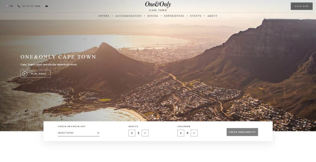
The One & Only
-
- Location: Cape Town, South Africa
- Best Feature: Availability Checker
The One & Only is one of the most spectacular and famous hotels in Cape Town (and the rest of South Africa, too, in fact). It makes a great example in this article, as its prestige, luxury, and sleek design are all immediately reflected upon visiting its website.
With a classic, simple black-and-color-on-white look, the overall design of the One & Only website is noninvasive yet visually striking.
Their subtle, floating bookings widget is one of the main reasons their site is a well-designed winner. Almost all good hotel websites will feature some tool like this, but how it’s positioned here (and even hidden slightly more on mobile) allows visitors to check available dates without the pressure to immediately make a booking, or the inconvenience of sending an email or making a call – as some hotel websites encourage.

Another interesting takeaway, aside from the fact that the rest of the webpage has a strangely blog-ish feel to it, is that the image/video slider at the top of the page isn’t selling the resort itself, it’s selling the lifestyle. It’s selling the lifestyle, a marketing technique as old as time. Instead of photos of the suites, pool, restaurant, etc. (which can all be found further down the page), you are met with simple stunning photos/videos of a landscape, a couple in a wine cellar, and a child playing in their hotel room.
These images and videos cast a wide net, attracting a wide range of demographics to the resort. This is a smart way to position your hotel, as it allows you to promote more than just your luxury rooms, services, and staff—instead, it promotes the idea that there’s a reason that your potential guests should book with you instead of another equally luxurious resort.
Evason Ana Mandara
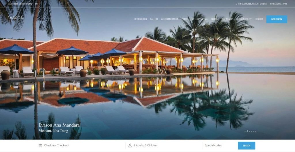
- Location: Nha Trang, Vietnam
- Best Feature: A simple, winning tag line
“Nha Trang’s only beachfront resort.” Even though it’s a few mere pixels below “the fold”, this opening line is an instant ‘marketing hook’ in a customer’s mind. Often, the subconscious question that usually comes to mind when browsing for bookings is, ‘Why should I book this place over another?’.
This opening line answers your question and further cements the idea of a beachfront resort. If you’re looking at other hotels in Nha Trang after this one, you might love them, but you’ll always have that line in the back of your mind – “But this one isn’t a beach resort…”
Simple techniques like this can be a winner – especially when combined with such stunning photos of the beachfront. These sorts of tactics can be much harder to come up with than a clever booking widget or some luxury photos, but in some ways, they are much easier. After all, you’re simply selling the location, not the lifestyle/image like the One & Only.
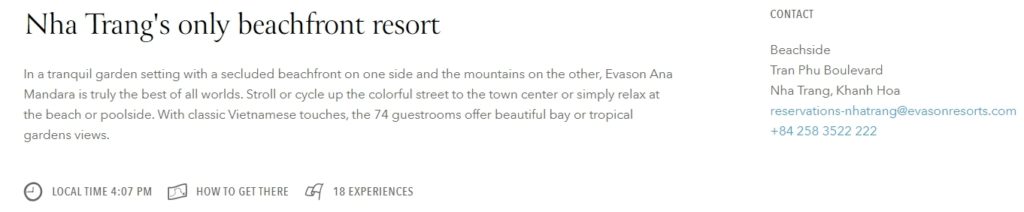
Another excellent design choice on the Evason Ana Mandara’s website is a straightforward menu along the top, which almost reads as a ‘points of interest’ list. Without wasting time, you know that this location offers specials, spa/wellness treatments, dining & experiences and is involved in sustainability efforts. Once again, this casts a wide net, attracting many different kinds of people who all book their accommodation with varying reasons regarding why this location works best for them.
More generally, sustainability factors are becoming increasingly important in the hotel and tourism industries, especially in areas like Southeast Asia, where tourism has caused its fair share of damage in the process of creating jobs and industry.
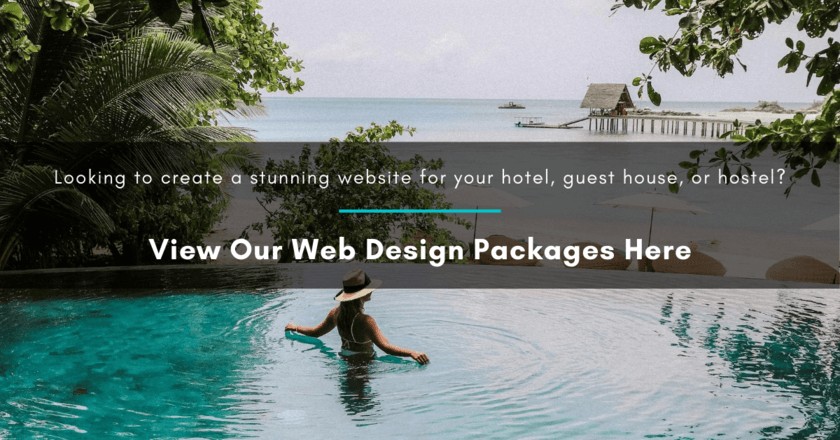
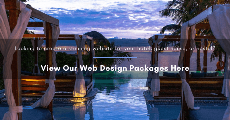
Hoping to build your own beautiful travel website? Click here to view our web design packages
Waldorf Astoria Los Cabos
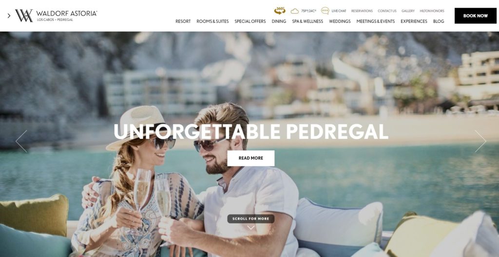
- Location: Cabo San Lucas, Mexico
- Best Feature: 360-degree view app, and weather widget
Have you ever looked at a potential accommodation option, only wishing you could step into the screen and look around? Well, thanks to the creation of 360-degree photography, this hotel website offers exactly that. Around the center of the menu bar sits a “360” icon, which allows you to explore the whole premises, looking around and exploring things as if you’re really there.
This is quite a cool feature, and while it might not be the make-or-break in terms of securing a booking, it certainly shows guests that they have an impressive sense of creativity and attention to detail. Combined with the live weather report listed alongside it on the menu, these features create a feeling of transparency—that the Waldorf Astoria is not trying to show you ‘just one side’ of the location but allows you to see all of it for what it actually is.

Another great feature of this hotel website is the drop-down menu. Each sub-menu item has a picture associated with it. Most people visiting hotel websites in anticipation of booking are looking to see certain features of the resort that are important to them, which makes this drop-down menu such a great feature. Instead of entering a back-and-forth navigation nightmare, visitors are able to easily navigate to the pictures they’re surely looking for.
Want to check out the rooms? Well, here they are at a glance, so you can already get an idea of which rooms you’re keen to look at. Have questions about dining? The dining drop-down shows that the resort has two on-site restaurants, classes, and private or in-room dining, all available.
These design choices fall deeper into the UI/UX design area of web development, where designers and developers must try to anticipate the ‘how’ and ‘why’ of how users may interact with the website.
Badrutt’s Palace
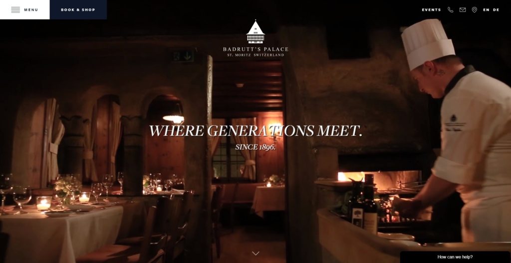
- Location: St Moritz, Switzerland
- Best Feature: The Intro Video
The website for Badrutt’s Palace in Switzerland shows how a few flash features combined with simple, effective, lightweight web design can elevate an honest (and honestly gorgeous) representation of a hotel.
The intro video (or hero video, as some might refer to it) is a simple, Wes Anderson-esque video that combines short clips of the bellboys and chefs going about their daily activities, a few outdoor time-lapses and clips, and some simple pans across the interiors of the establishment.
This approach is similar to One & Only’s marketing style. Only here, we’re combining the interest points of the actual hotel with the lifestyle it appears to be associated with.
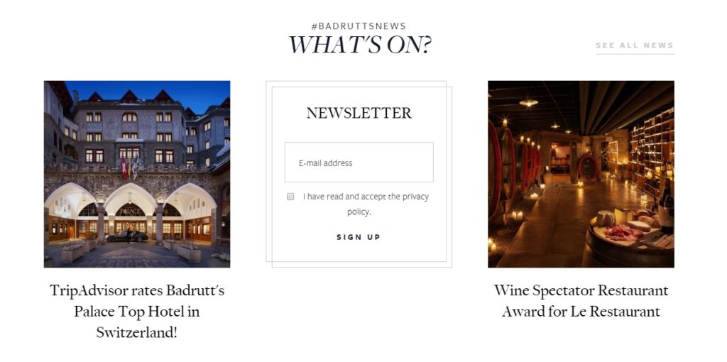
One of the best parts of this website, as well-designed and intricate in detail as it is, is that the designers were able to hold back on the flashiness. As you scroll down the page, blocks of interest, such as blog posts and events, simply slide/fade into appearance, offering a calming experience where you aren’t overloaded with information. You can actually take some time to read what the hotel is about.
The only thing we didn’t like about this website is the menu—it’s a very cool animation that many people will like, but we feel it breaks the immersive experience by feeling like a very separate feature from the rest of the website. This could almost be compared to a pop-up login window, which breaks the user flow of interaction with the site and subconsciously asks one to reorient themselves.
Click here to view our web design packages and create your own stunning travel website
Casa Angelina
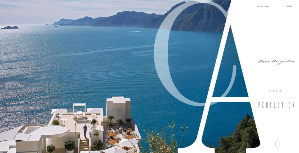
- Location: Amalfi, Italy
- Best Feature: Amazing interactive and responsive design
Casa Angelina’s website is a great example of how any hotel or business can embrace modern web design and create an incredible visual experience for customers.
Casa Angelina is certainly doing all the normal things a hotel website should do to ensure some customer retention (great images, important information front and center, and a simple menu layout that is effective and looks great). However, they have forgone a basic website design in place of an incredible moving puzzle of pieces, the layout of which was meticulously planned both for web and mobile use.
The reason, though, that their website is so great for using this style is not simply for the style itself. The fact is that Casa Angelina managed to make a complexly constructed and laid-out site simple to understand and easy and quick to use. Without these attributes, such a complex design would be wasted and could do the opposite, driving customers away. Their website is also a wonderful display of the effective use of space. At any given point on the home page, images take up at least 50% of the visual space, and as you scroll down, blocks move around in ways that direct your eyes towards useful information, with no wasted space.

Even if their fonts are a little light to be placed on a white background in places, this is an incredible example of groundbreaking and forward-thinking web design that makes Casa Angelina’s website a winner on this list, as far as we’re concerned.
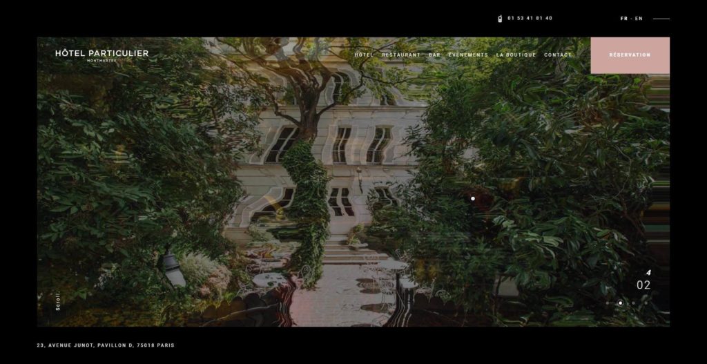
Hotel Particulier
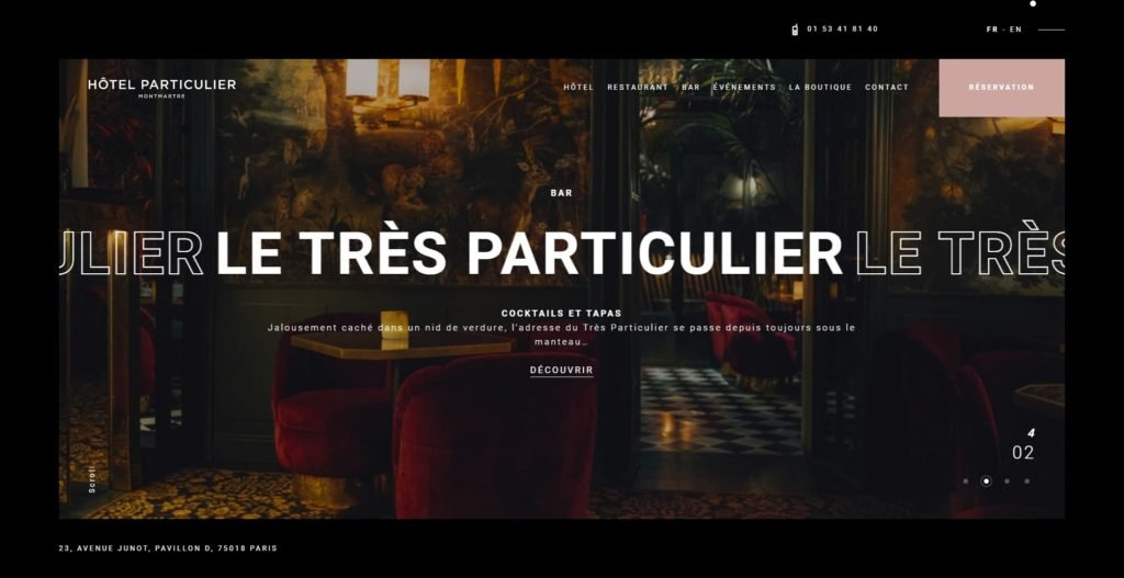
- Location: Montmarte, France
- Best Feature: Using distraction as an attraction
The Hotel Particulier is one of the most incredible bespoke websites we’ve come across in any industry. They’ve taken what the Casa Angelina achieved and gone a step further to perfect it. While the feel is a lot less “clear, white sandy beaches” and a lot more “European city hotel,” it still captures the same feeling of incredibly well-used space and design choices.
The font choices, layout, and animations on the website all fall within the boundaries of popular modern graphic design – but what makes this a winning combination is how well everything gels together. There aren’t any choices here that seem out of place – everything necessary is readily accessible, and just like the Casa Angelina site, images make up most of the visual space no matter where you are on the page.
The animations on the intro images are especially enticing. Blending psychedelically between one another, they almost appear to give a little shout of “Hey, customer, I’m here showing you some images!”. This feature would be annoying in many implementations, yet it works here. We are just adding a small change to set this website’s images apart from all the others we’ve looked at in this article. This will likely place a little ‘hook’ in the user’s mind, as no other websites we encountered had this feature.
Lastly, their touch of “See you Soon. Love” as a title card at the bottom of the home page is a warm, welcoming touch that erases any doubts about how ‘caring’ this establishment is, especially after their site shows them to be a bold, stark and stunning brand.
Europejski
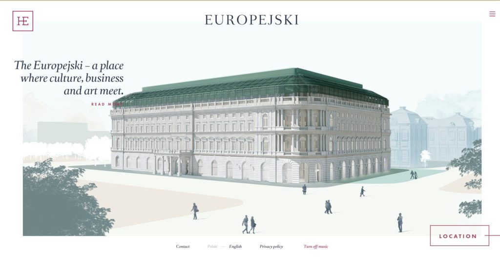
- Location: Warsaw, Poland
- Best Feature: Interactive design like no other
Visiting the Europejski website feels like a hotel visit within itself. You’re met with a beautifully animated intro video, which seamlessly blends into an interactive website designed in the same style, with no break in immersion along the way.
A simple homepage with a very humble sketch of the hotel appears, with a simple tagline “a place where culture, business, and art meet.” Here, they hit on the ‘selling a lifestyle’ target. A beautiful and simple overlay menu is available to the right, and anything else you may need to know (website language, location, contact details) is all readily available right there.
When you scroll down, however, you’ll realize the fun has just begun. The drawing of the hotel jumps out at you, spinning in 3d, and settles into a map of the surrounding area in a beautiful and seamless animation that must have been somewhat mind boggling to build.
Scrolling down again reveals another perspective flip, spinning to the side of the hotel where their retail and office spaces lie. Again, we flip into the Lifestyle, Hotel, History, and Contact pages. This is an undeniable winner of web design for a number of reasons.
Firstly, the animations and designs are beautiful, so any visitor will likely look at every page on the site. This means there’s more time for a customer to get hooked on some offer or feature and secure their stay at the hotel. In addition, by flipping through this biography-esque page animation, you unintentionally read many interesting points that educate you about the premises and their surroundings.

In short, a well-illustrated and well-animated design that’s fun to play with can lead a user to inadvertently read every single piece of text on the site and become somewhat of an expert on the hotel in the process. This goal is very difficult to achieve, but as we can see here, it is not impossible.
What Sets Award-Winning Hotel Websites Apart
Award-winning hotel websites are not just about aesthetics; they are about creating an engaging, user-friendly experience that converts visitors into loyal guests. Industry leaders have recognized these websites for their innovation, design, and ability to meet the needs of today’s travelers.
Seamless User Experience (UX)
One critical factor that sets award-winning hotel websites apart is their focus on seamless user experience. These websites are designed with the user in mind, ensuring that every interaction is smooth, intuitive, and enjoyable. From easy navigation to quick load times and minimal clicks to make a booking, the user journey is carefully crafted to minimize friction and enhance satisfaction.
The Peninsula Hotels
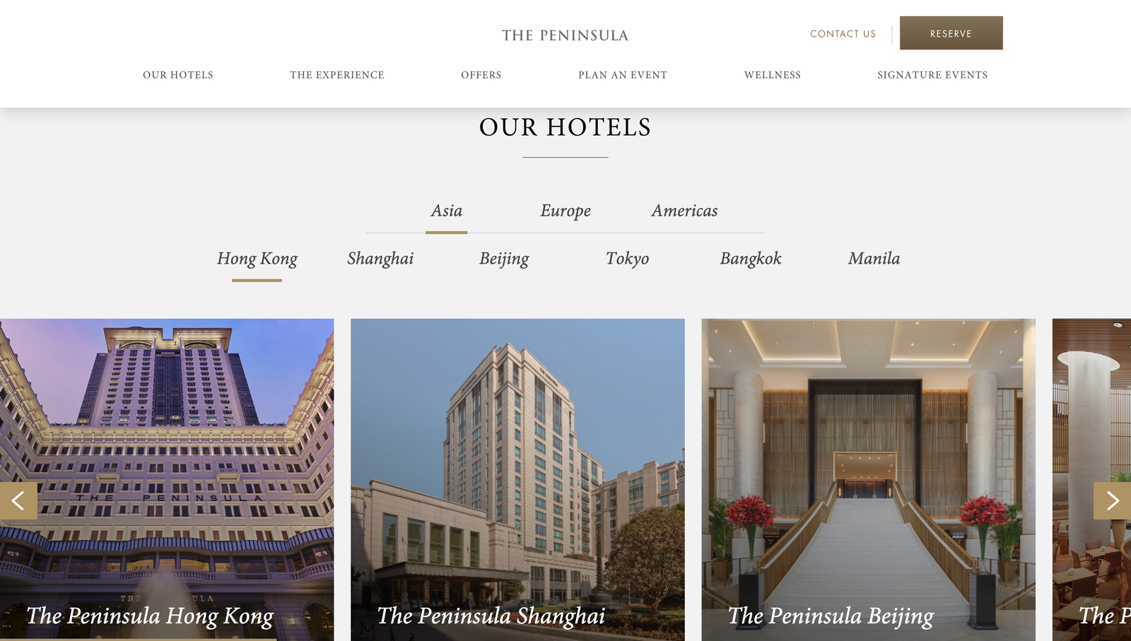
Known for its elegant design and user-centric experience, The Peninsula Hotels website offers a seamless journey from browsing to booking. The site’s intuitive layout, quick navigation, and luxurious visuals create an immersive experience that reflects the brand’s luxury.
Innovative Booking Features
The booking process is at the heart of any hotel website, and award-winning sites often feature innovative booking systems that are both user-friendly and powerful. Dynamic pricing models, special offer notifications, and real-time availability checks are just a few examples of the features that make the booking experience seamless and efficient. Additionally, these websites often include integration with loyalty programs, allowing returning guests to access their rewards and benefits easily no matter which hotel they’re staying at around the world.
The Ritz-Carlton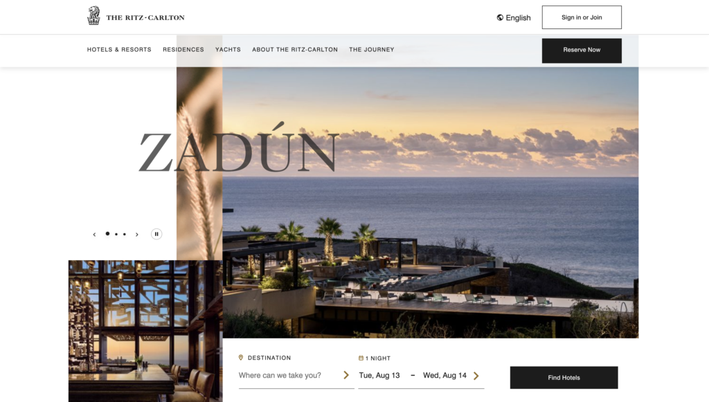
The Ritz-Carlton’s website is celebrated for its innovative booking features, including personalized recommendations and real-time availability. The booking system is designed to be both powerful and easy to use, ensuring a smooth experience from start to finish.
Accessibility and Inclusivity
Accessibility is a growing concern in web design, and the best hotel websites are leading the way in creating inclusive experiences. Award-winning sites ensure that their content is accessible to all users, including those with disabilities. This includes features like screen reader compatibility, alternative image text, and keyboard navigability. By prioritizing accessibility, these websites comply with legal standards and demonstrate a commitment to inclusivity, which can enhance their brand reputation and appeal.
Marriott Hotels
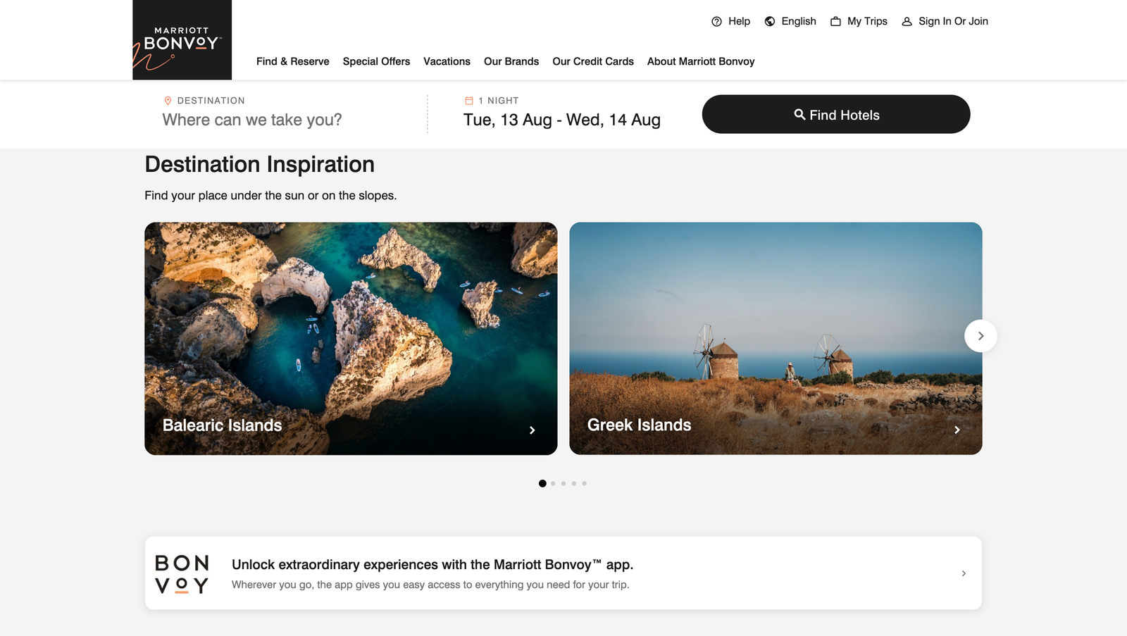
Marriott’s website sets a high standard for accessibility, featuring comprehensive tools that ensure all users, including those with disabilities, can easily navigate the site. From alternative text for images to screen reader compatibility, Marriott’s commitment to inclusivity is evident in every aspect of its web design.
In Summary: Designing The Best Website for Hotels
To conclude this study, let’s look at a few pointers we’ve picked up from comparing all these different websites (as well as many others that didn’t make the cut). There’s always something to learn when observing the work of others—after all, inspiration is the root of creativity!
Images Are Number One in Luxury Hotel Website Design
While there are many crossover factors, the one thing that none of these websites lack is a wide range of clear, large images that are visually attractive yet honest. The number one reason customers might visit a hotel website is to examine images of the hotel, making good photographs (and a good photographer) the most vital point to nail down when designing a hotel website.

Boutique Hotel Websites can rely on their Location for Marketing
Suppose a hotel doesn’t have the most incredible five-star restaurant, a hundred-acre property, or some award-winning entertainment options. In that case, there are still ways to show potential guests why they’re a contender.
When it comes to things like community involvement, green/sustainable initiatives, unique locations, or unique activities, the travel and tourism market is growing increasingly favorable to these features. After all, emotion is one of the most important steps in achieving virality, so it’s not to be taken lightly what a ‘save the turtles’ initiative can do to attract customers.
Keep Resort Website Design Simple, and Effective
Another common feature of these websites is a very common design combination: a white background with off-black text, a script title font combined with a sans-serif paragraph font, and a few light CSS animations to keep everything pleasing to the eye.
There really is no reason to get overly complicated or crowd the page. Most people can only focus on one or two things at a time, at a stretch. This means how you choose to divide your content and how much of that you display on your homepage are two incredibly important factors to try and implement in a “clean” and “sleek” manner.
Don’t overthink it – Hospitality Website Design isn’t Complicated
This is somewhat of a follow-up to the previous point, but simply put, there’s not much to a hotel website. If you’ve got great photos, smartly placed booking widgets, some useful buttons, and a functional menu, you’re already almost 50% of the way there.
Once you throw in a talented web designer, creative SEO, and a few little bells and whistles, you’re ready to be open for bookings and filling rooms.
Creating Tailored Guest Journeys through Personalized User Experiences
In the modern digital landscape, personalization is vital to engaging potential guests. Incorporating personalized elements, such as dynamic content based on user behavior, personalized recommendations, and tailored marketing messages, can significantly enhance the user experience. Award-winning hotel websites often leverage data to provide a customized journey for each visitor, making the experience more relevant and engaging, ultimately leading to higher conversion rates.
Incorporating Cutting-Edge Technology for Enhanced Interactivity and Efficiency
Cutting-edge technology is a crucial feature of modern hotel websites, with virtual tours, augmented reality (AR), and 360-degree views offering guests an immersive preview of the property. Additionally, AI and chatbots enhance user experience by providing instant assistance and streamlining the booking process, making it more efficient and user-friendly.
Conclusion: The Future of Hotel Website Design
As we look ahead, it’s clear that the future of hotel website design lies in personalization, technological integration, and a commitment to user experience. Today’s top trending and award-winning hotel websites understand travelers’ evolving needs and respond with innovative, immersive, and user-centric designs. Whether you’re looking to inspire wanderlust, streamline the booking process, or showcase your hotel’s unique story, these elements are essential in creating a website that attracts visitors and turns them into loyal guests.
[/vc_column_text][/vc_column][/vc_row]

Matt is a travel entrepreneur with over a decade of experience across digital marketing, operations, and asset investment. His ventures include founding the agency Travel Tractions, successfully buying and selling multiple travel websites, and owning a boutique hotel in his home base of Cape Town. His writing focuses on the intersection of data-driven marketing and real-world business growth in the tourism sector.