After working on tourism website development with many travel agencies, tour providers, and travel websites over the years, we’ve learned a fair bit about these kinds of websites. One thing has become extremely clear to us: travel agency website designs are possibly the most important part of driving conversions.
Let’s not get it twisted – content is king, and the tours/travel options provided are almost always the most important factor on the site. But if you take two sites with the same level of content quality, there’s no doubt that it’ll be the travel websites’ designs that become the deciding factor for the customer and the usability of the website that drives conversions and directs traffic. This is probably because the average user is more likely to trust a website that looks good and works well.
Whether you’re marketing villas in Tuscany, hiking trips in Peru, or offering beach vacations in Bali, your website’s visual appeal is paramount.
We’ve used our experience with travel industry websites to write this guide on the best tour and travel website designs. Finding the best practices and design trends that will help you turn visits into conversions and help you retain your loyal customers.
Let’s take a closer look.
Why Tour and Travel Websites Need Amazing Designs
In the travel and tourism industry, visual media has always been one of the best ways to market your business. Back in the day, the travel and tourism industry used postcards, flyers and brochures to captivate potential customers, these days your website can do all the heavy lifting and help to drive bookings.
In 2018, over 80% of travel bookings were made digitally. Since then, this number has increased even further which really drove the importance of visual experience in the digital sphere. It becomes pretty clear that design and visual communications are some of the most important factors in travel. After all, it may be the one thing that puts you above your competitor.
One of the most important aspects of a travel website is the theme it uses. Popular website themes like “Traveler“, “Adventure Tours“, and “Travelicious” offer a range of features tailored to travel agencies. These themes often come with built-in search functionalities in the hero section, allowing users to easily find tours, destinations, or activities right from the homepage.
Other key design features include:
- Responsive Design: Ensuring the website looks great and functions well on all devices.
- High-Quality Images: Utilizing large, stunning images to capture the user’s attention.
- Interactive Elements: Incorporating features like interactive maps, booking widgets, and gamified content to engage users.
- Clear Call-to-Actions (CTAs): Strategically placed buttons and links that guide users toward making a booking or inquiry.
- User-Friendly Navigation: Simple, intuitive navigation to enhance user experience and reduce bounce rates.

In addition, there are so many aspects to consider when picking a design for your website that you could apply to different niches. For example, if you’re selling packages aimed at younger travelers on your travel agency website, you’ll most probably want to gear the imagery and design towards the idea of an influencer-style trip.
If your demographic happens to be pensioners or retirees, then you can communicate the idea of comfort and ease quickly and without saying a word using the website design.
Now, this might seem like a lot to get your head around. But by analyzing what works and what doesn’t on other sites, you can start to get some ideas and direction (like we did in our guide to the best hotel website designs). In this guide, that’s what we’re about to do.
Travel Agency Websites: The 10 Best Designs
Let’s take a look at our ten favorite travel agency website designs, each with something of their own that makes them functional, well-designed, and a pleasure to use. Naturally, each of these is a public website. So if you know a little about web design, you can use your browser developer tools to take a closer look at the back-end of these designs.
One note: In the modern age, most websites have some form of interactivity, animation, or movement incorporated into the design. These websites are no different, and while we tried to get the best possible images of the features we loved, we’d recommend visiting some of them if you want to try out some of the features for yourself.
Now, let’s start analyzing.
1. Visit Humboldt
Winning Feature: An Interactive Map.
Humboldt County is a wooded area in northern California known for being somewhat of the “Hippy County” of the state (which says a lot). It’s known for its redwood forests and remote atmosphere, and their county tourism website does everything to convey and confirm that.
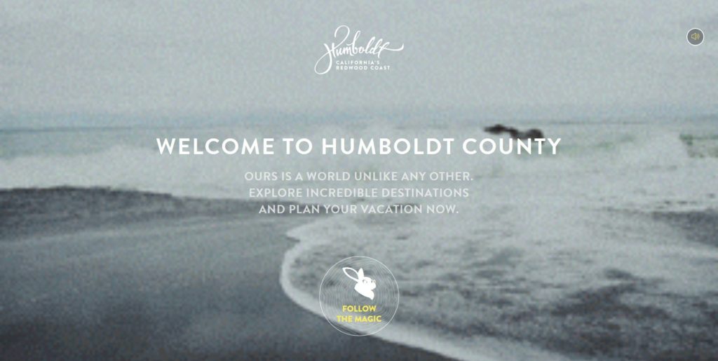
You are greeted with a beautifully illustrated interactive map of the county showcasing all the regions of Humboldt County you can visit. Clicking on any name on the map takes you to detailed information about that region, including activities to do, directions, and cozy places to stay. This seamless navigation makes planning your trip both informative and engaging.

This design is a successful attempt for many reasons. One of these is that the gamified design makes it really hard not to go through the whole guided process of creating an itinerary. This means that customers will spend longer on the site or perhaps even run it through a few times.
This is not only great for SEO and user experience, but when you combine it with stunning images, you’re leaving the user with a solid memory of what they’ve seen and a great impression that won’t soon go away.
2. ToursByLocals
Winning Feature: Live Virtual Tour
ToursByLocals’ philosophy centers on truly getting to know a place from the people who know it best—the locals. Each guide is a local expert, offering a deep and authentic understanding of their area. The website not only highlights the expertise of these guides but also provides reviews for each one, ensuring transparency and trust. Travelers can read about other users’ experiences and message the guides directly, allowing for personalized communication and the opportunity to tailor the tour to their interests.
Their website design is clean and user-friendly, making it easy to browse through a variety of tours guided by local experts. ToursByLocals provides a unique approach to guided tours by offering live virtual tour options, making it possible to explore the world from the comfort of your home. This feature is particularly appealing in today’s increasingly digital world, where flexibility and accessibility are key. The emphasis on live virtual tours allows users to experience real-time exploration of different locations, guided by knowledgeable locals who provide in-depth insights and personalized interactions.
ToursByLocals successfully targets a niche audience by focusing on the quality and depth of their tour experiences. This approach not only attracts history and culture enthusiasts but also provides a valuable alternative for those who prefer virtual travel. Their strategy of offering specialized and engaging tours sets them apart in the travel industry, demonstrating a keen understanding of their customers’ needs and preferences.
3. Thrillophilia
Winning Feature: Everything is a CTA, and you didn’t even realize it.
Thrillophilia is an adventure / extreme tours and activities website that offers a little more to the hardcore, adventurous traveler. It has a beautifully designed website, with parts similar to an AirBnB design, and a great bookings landing page when you first visit it.
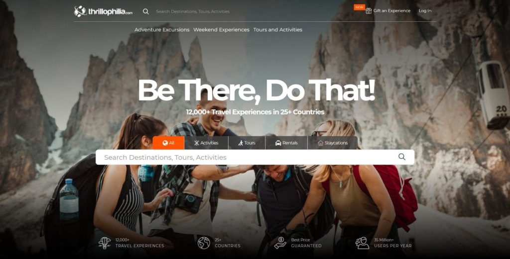
Here, you can search for tours, activities, rentals, etc. They also use this landing space to show some stats, such as the countries they have on their books, the number of satisfied customers, and the 12000+ tours they provide. While these may seem like an obvious touch, they can really make for a good, long-lasting impression in the mind of a visitor to the site.
However, there’s something about Thrillophilia’s website that we couldn’t quite put our finger on that makes interacting with it feel ‘guided’ or ‘directed’ in a manner of speaking. The best way we can put this in words is to say that nearly everything on the website is a CTA of some sort.
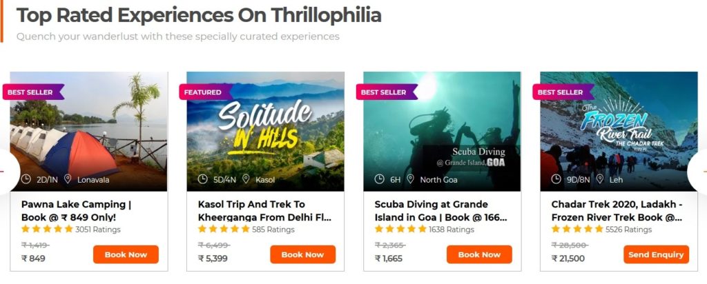
A CTA (or call-to-action) refers to a web or design element (usually a button or a link) that prompts you to do something to continue using the website or app. On this website, almost everything works as such – both thanks to color usage (in the buttons, stars, and best-seller tags), and great category buttons.
Their category buttons are specifically a winner. They’re small, rounded images that almost prompt you to “click to enlarge” to see more of the activity or city you’re eyeing.
The user is aware that this will move them to another page and not simply enlarge the photo. But the association makes interaction easy and natural and encourages you to click, click, click on to explore more of the activities they have on offer.
Sure, you could say the same for a lot of travel and tour websites – the photos often make you want to click on them. However, there’s something extremely natural and guided about Thrillophilia that, whether intentional or not, makes the website a memorable breeze to use and navigate.
Hoping to build your own beautiful travel website? Click here to view our web design packages
4. Agoda
Winning Feature: Everything you need, all in one place.
Agoda has the least-cluttered, shortest-length homepage of all the websites on this list – yet somehow, they’re one of the most successful. Established brands don’t usually need to try as hard to retain or attract new customers. But there are a number of things Agoda is doing well to ensure they’re one of the top premium travel agent websites around the world.
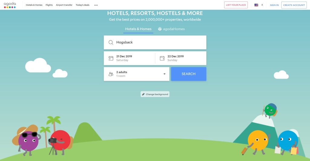
Let’s take a look at some of the small things they’re doing to keep their website as user-friendly as possible.
Firstly, everything you need from them is immediately accessible and visible, above the fold (meaning: on the part of the page you can see) as you arrive on their homepage.
This includes:
- their booking widget,
- an option to change your location or currency,
- a link to adding your own listing on their service,
- and shortcuts to hotels, flights, airport transfers, and deals/specials.
That’s quite a list – and you probably can’t think of anything that’s missing here.

Below this, they simply have a few testimonials and small tiles of locations, keeping the rest of the homepage pretty bare. This also directs the user to focus on their booking or looking at rentals and not worry about anything else. The website is almost telling you, “Just search for it; we’ve got it.”
One of the reasons this works so well is that they’ve used space appropriately. By including everything necessary with small text links on the landing page, they have managed to save a good amount of space and clutter, allowing for a large, clean, and easy-to-use design.
Bonus points for their “change background” button, which allows for some easy, fun customization when you’re not even logged in. This is another great example of gamification, although some might consider this iteration a little distracting.
5. Holiday Pirates
Winning Feature: Friendly, funny, and comforting copy.
One of the scariest parts of booking tours and activities can be the idea of trusting someone with your money to secure a product and deliver what they claim they can offer. One of the best ways to combat this is to have a well-designed website that speaks to trust and accountability. We can easily say that all the sites on this list meet that requirement.
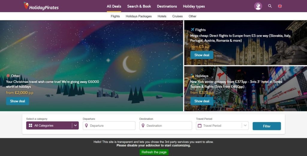
However, Holiday Pirates have gone the extra step and presented some truly well-planned copy on their website. This makes browsing the site a laugh and allows things to catch your interest that otherwise might not.
While their website is pretty standard overall, their copy is really a significant step above the rest, and you can easily see why.
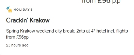
“Marra-yes please!” is the name of their tour of Marrakech.
“Crackin’ Krakow” is one of their Polish tours.
The overall tone of the copy on the website is fun, humorous, and playful – yet they still have all the important information ready and clear. This is so effective because it helps a visitor let their guard down a little, and trust the site a little more. And they maintain just the right appropriate level of seriousness (where it’s important) so that the entire site doesn’t just come across as a joke.
It’s the ability to tread this line that makes HolidayPirates appear trustworthy, friendly, and on your level. This just goes to show how important it is to never take yourself too seriously and also to take risks and try and do something different. If you tried to convince some travel websites to make their entire brand identity a humorous one, most would think you’re crazy. But maybe, just maybe, they might be wrong.
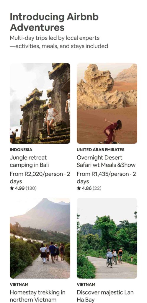
6. AirBnB
Winning Feature: Mobile-first design at its best.
It may seem a little unfair to include AirBnB on this list – after all, they’re probably the most popular and well-established digital travel company. Furthermore, their Experiences section is really taking off. Meaning they’re really succeeding in pivoting towards experience, and tour-based activities.
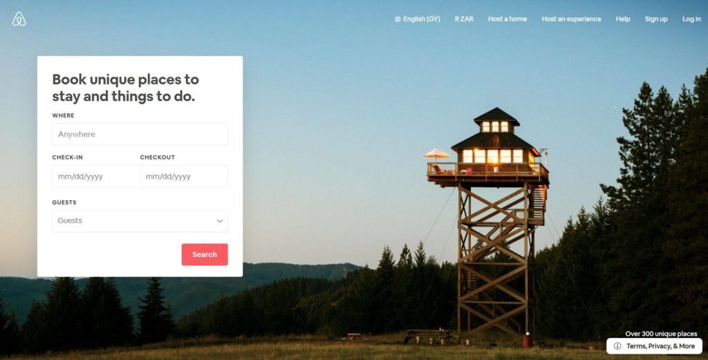
Being one of the biggest companies in the niche, of course, means that they have a large budget – and no expense has been spared when it comes to their website and app.
One of the coolest parts of their website is how responsive it is. This refers to elements inside the web page reorganizing themselves as you view the page on devices with screens of different sizes. The site has one of the most seamless transitions we’ve ever seen, from full-screen view to the mobile level.
Now, this is important for two reasons.
Firstly, you ideally want both your app and your website to work in the same way. Take, for example, a user who has only viewed AirBnB through their app and has to visit the website for the first time. This transition should be as natural as possible, and the user should immediately understand how all the elements they’re familiar with work in a different context.
Secondly, as per the report we quoted earlier in this article, over a quarter of travel-related searches occurred on mobile in the last quarter of 2018. Mobile is slowly dominating the market. As such, AirBnB’s mobile-first approach allows them to create for what is popular and build upon that by optimizing a full-size version for desktop users.
7. Rome2Rio
Winning Feature: Amazing transport planning widget.
Let’s face it – Rome2Rio is not the most attractive of travel websites. It’s got quite a standard look, and while the design is tasteful, it might not be overly impressive. But, what they’ve done to set themselves apart is to create one of the niftiest and most innovative travel tools you could find on the internet.
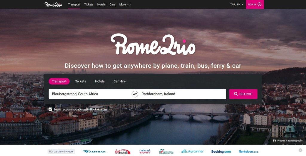
Their transport search widget allows you to search for transport across the world, across all different transportation types (boats, planes, taxis, trains, etc.), from door to door. This means you simply enter your home address or departure airport and the exact location of the first item on your agenda at your next destination. It’ll show you the cheapest options for every single leg of travel along the way.

In an interesting way, they have positioned themselves to possibly become a very important part of the digital travel agency world. You might book your activities and tours with another one of the websites mentioned in this list. But Rome2Rio can still offer the added convenience of organizing all your transport beforehand.
Once again, this is sort of a divide-and-conquer approach, allowing them to focus on a niche where there is less competition. The closest tool we’ve seen to something like this would be Google’s own travel features, and even then, it’s not quite as handy as this one.
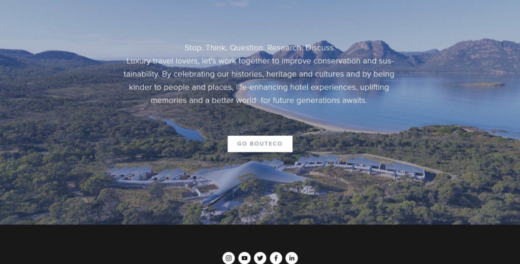
8. BoutEco
Winning Feature: Photos and designs communicate their values expertly.
It seems that web design and UX (user experience) are extremely dependent on trends these days. One of the biggest trends in recent years has been the rise of eco-friendly travel and tourism initiatives.
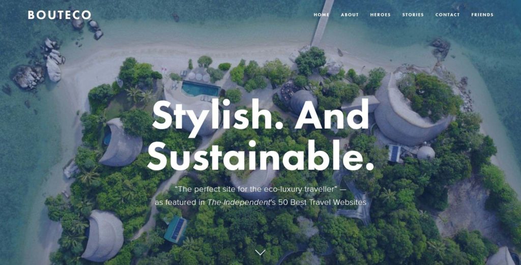
BoutEco calls themselves “stylish and sustainable”, and offer a service to help eco-travelers find hotels and accommodation that align with their own morals. They also help eco-conscious hotels improve their sustainability and allow newer ones to transition into a sustainable model with their help.
Now, nothing about their site screams eco-friendly at face value – it’s just a lot of beautiful accommodation shots in nature. However, there are small hints or ‘gives’ that allude to sustainability.
For example, all their photos are strictly taken at a wider angle, showing as much as possible – or more directly, not hiding anything. In addition, the layout of the website feels extremely ‘clean’ and directed – both values that are extremely important when it comes to sustainability.
This is possibly the most subtle example of good design on this list, but it’s so well executed that it definitely deserves some recognition. Not every attempt at connecting with a user or improving their experience needs to be blatant or obvious. Sometimes subtlety is key, and in cases like this, we can easily see why.
9. Get Your Guide
Winning Feature: The most stunning images in the game.
We all know Get Your Guide and their stunning cover images that pop up to meet you upon arrival on their site. One of the most interesting things about GYG’s fantastic image use is that it doesn’t need to be explained, broken down, or studied. You can immediately see that it works and see how.
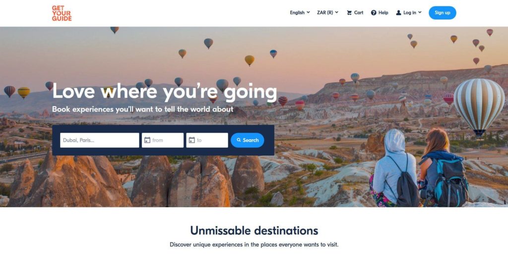
So, you might ask, what can I learn from their site if I already know how important good images are? Well, it’s more of a reference point than anything else.
Any photographer preparing images for a tour or travel site would be well advised to look at Get Your Guide’s website and images as a reference point. Studying how their photos are broken down and what kind of colors, landscapes, visuals, etc. they focus on will almost definitely lead to a more impressive and successful set of pictures.
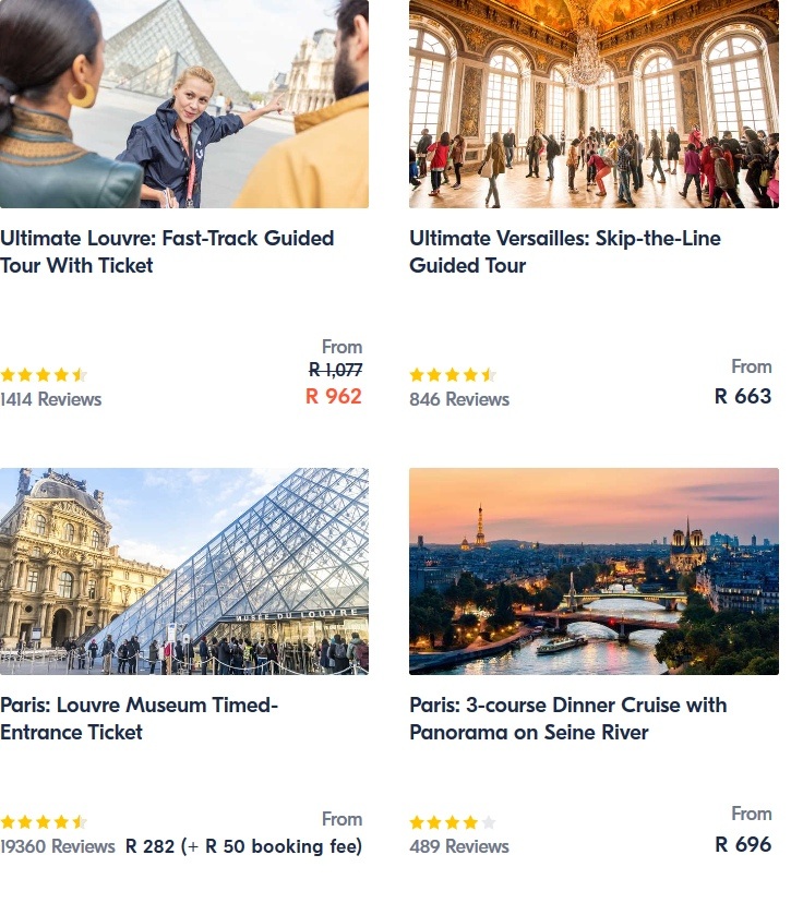
One thing their photos do best is to allow you to step into the shoes of a traveler on a GYG tour. Most, if not all, of the photographs are taken at eye level, appearing almost as if you’re on the tour already.
Secondly, if there are subjects in the photo, they’re often facing away from the camera. This helps keep the immersion of placing yourself in the shoes of that traveler or imagining yourself standing at the given viewpoint.
This is an example of really breaking down and dissecting the user experience. Taking a known principle such as “Great photos sell tours” and going one step further, asking what it is that makes great photos great, and what about a great photo can really sell an activity.
10. With Locals
Winning Feature: Well-planned categories and info – with personalization.
WithLocals, similar to Context Travel, is a niche tour and activity agency. Allowing those seeking genuine experiences to partner up with locals all around the world. These locals then guide them on customizable tours through classes, activities, and more.
Now, this is a fantastic idea – and, in our opinion, long overdue. However, this could get messy – after all, you’re dealing with thousands of locations, dozens of dialects, and languages. And the idea of customizable tours alone can be a tricky road to venture down, for the tour providers. Luckily, WithLocals encountered none of these issues.
Their website is a great example of one of the most important principles of SEO, which has a large amount of crossover into design and UX: Categories.
Firstly, WithLocals has their simple categories – these are the ones you might imagine someone might search on Google, such as “day trips”, “night tours”, “family-friendly”, etc.
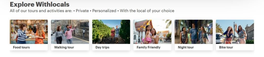
Next up, they’ve broken down their popular section into two: one for locations and another for experiences or activities. This means that, at a glance, you can get an idea of some of the more places to visit, as well as which kinds of tours, are the most popular across the board.
Spoiler: it’s food-related… No surprises there, and it fits in with their authentic and local theme.
Past this, they have a blog-feed-style panel of buttons to various categories, which they have seemingly identified based on what their users are looking for. For example, categories like “Top 5 Cities for Foodies” and “Top 5 Cities to Visit with Kids” all serve a great user experience. They allow you to find what you’re looking for all within one click of the home page while still offering something for everyone.
This is less of a divide-and-conquer approach and more of a strategic shotgun approach. First, spray and pray and see what hits, and second, focus only on the spots where hits happened—metaphorically speaking, of course.
Click here to create your own stunning travel website – view our web design packages
What do the best Travel Agency Websites have in common?
Well, that got pretty deep, pretty fast. Let’s do a little refresher and just touch on the most important points – the things all these websites have in common and the ideas that are being followed across the board.
Mobile-first Design Principles
As we mentioned, mobile is taking over. This means that it’s important to choose either a mobile-first or desktop-first design. The former is definitely more popular, just look to Twitter’s current desktop website as an example.

Building upon this, you want to make sure that learning how to interact with your website is seamless regardless of the device. To use another common example, YouTube has a fantastic mobile version, where pretty much every single desktop function has been transported over in one way or another.
While there’s a good few thousand pixels difference between your desktop and mobile version, they should essentially be windows to the same exact thing and feel like it too.
Large, Stunning Images
We won’t repeat ourselves again here – to keep things simple, use lots of large, stunning images. Remember, however, that images are some of the elements that can take the longest to load on a webpage. You should make sure your images are appropriately compressed and ready to be served as fast as possible – on a CDN if possible.

Also, while we’re on the topic, free commercial use images might be handy and readily available. But having your own individualized images will always help set you apart from the rest and are such a worthwhile investment.
Integrated Widgets for Bookings and Reservations
A custom widget can be a great expense, and it can be difficult to create from scratch – but it’s one of the best ways to truly separate yourself from the competition. If you can craft your own truly individual functionality that no one else can compete with, you’re well set up to dominate a niche.

That being said, it’s not imperative. If you can achieve a similar ease of use for your website using simple, effective categorization, CTAs, and tooltips, then by all means, you’re on the right track.
A Top-Class User Experience
UX is the name of the game, and it’s here to stay. You should always be asking yourself what the user wants, and be careful of how you impose your own goals and aims for a website. At the end of the day, the users define how a website will be received and used.

This isn’t to say that the user is in complete control. But at the end of the day, an app or service that’s trying to satisfy some gap in user intent will always be more successful than one that’s attempting to “tell” a user that they need the service being offered.
In Conclusion
You’ve got some pointers and some in-depth breakdowns. The best way to stay in the loop with these kinds of principles moving forward? Analyze, analyze, analyze.
One of the best efforts you can make when trying to improve your travel website, product, or service is to analyze your competitors’ website designs. See what they’re doing better—or worse—than you are, and start strategizing accordingly. By understanding the strengths and weaknesses in their website design and what elements users prefer most, you can identify opportunities to enhance your own site and better meet your customers’ needs.

Matt is a travel entrepreneur with over a decade of experience across digital marketing, operations, and asset investment. His ventures include founding the agency Travel Tractions, successfully buying and selling multiple travel websites, and owning a boutique hotel in his home base of Cape Town. His writing focuses on the intersection of data-driven marketing and real-world business growth in the tourism sector.