Are you a blogger, excursion business owner, or travel agency marketer on the hunt for the perfect tour website design? A good travel website is not just a digital brochure — it’s a way to captivate a large audience and drive more sales. So, how do you pick the right web design?
From our years of experience, we’ve come across and worked on countless travel web designs, so we have a lot to say. There are some key aspects to creating an effective design for your tourism website. Pair them with killer content, and you’ve got a shot at the number one spot.
We’ve done the legwork and compiled a list of the best travel website designs out there. But let’s not get ahead of ourselves. Before diving into the main components of a winning travel website design, let’s look at the importance of a comprehensive web layout.
Why Tour and Travel Websites Need Impressive Designs
In the competitive travel industry, having an impressive website design isn’t just about aesthetics — it’s about functionality, user experience, and converting web visitors.
By 2028, the global online travel market is set to be worth over $800 billion U.S., meaning there are more and more people booking tours and excursions digitally. If you can create a well-designed travel site, you could boost online visibility and ultimately drive more bookings.
Keep in mind that a visually engaging web design can bring visitors to your site, but that may not translate into conversions. Why? Potential customers are not just looking for beautiful imagery; instead, they want valuable insights from a credible travel source or industry expert.
13 Top Travel Website Designs
To fully grasp the significance of an effective travel website and how it converts visitors into customers, let’s explore a few design examples used by the best tour operators worldwide.
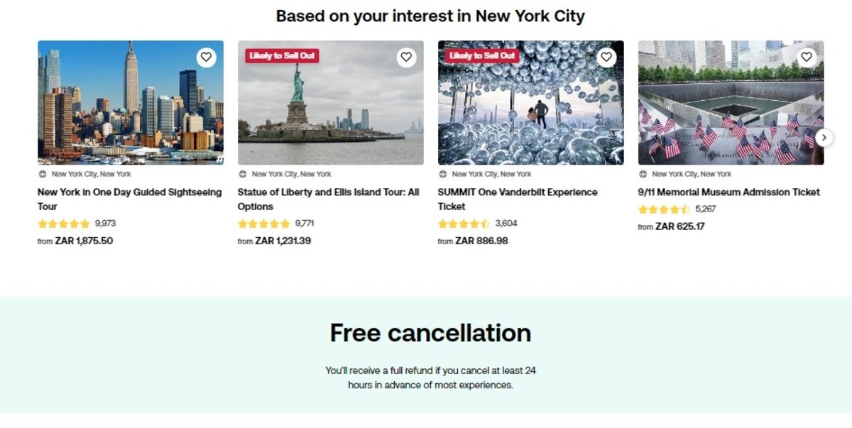
1. TripAdvisor
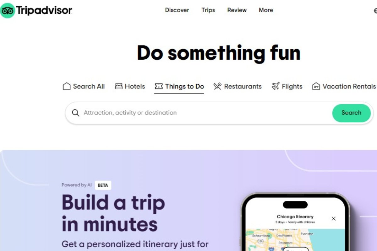
Winning Feature: Social Proof (reviews, ratings, and user-generated images)
TripAdvisor’s website design offers a comprehensive travel experience, allowing visitors to book hotels, flights, car rentals, and tours. This booking website features a simplistic design with numerous filter options for seamless navigation. The use of white space also helps with user-friendly navigation, making images and buttons stand out amidst the sea of content.
We like that TripAdvisor allows website visitors to curate their experience according to their preferences. The various language and currency options make this travel website accessible to a global audience, casting a wider net and engaging with more potential customers.
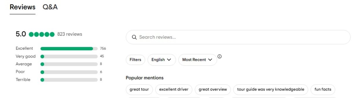
This is one of the best travel websites you can find, as its customer reviews, ratings, and user-generated content make it stand out among competitors. As a result, TripAdvisor is not only an online booking website but also a search engine where visitors filter through hundreds of tours using the site’s social proof as a guide.
TripAdvisor also offers an artificial intelligence (AI) assistant to help tourists plan their trips. Visitors can curate their tours, save itineraries, and share or collaborate with other travellers.
2. Viator

Winning Feature: Rewards System
As a TripAdvisor company, Viator provides the world’s largest marketplace of tours and activities. Unlike its parent company, this tourism website focuses on user convenience, highlighting the best excursions and breaking down their inclusions and exclusions.
Viator’s homepage welcomes you with a large search bar right in the middle of the page. This bar allows visitors to limit the number of tours that pop up by region, country, city, or activity.
The website design shows tours in a way that visitors can see the ratings, reviews, and prices. This helps with user-friendly navigation and ease of finding tours at various destinations.
A crucial feature on the homepage is the “Why book with Viator?” section. This reveals the company’s best features, like 24/7 customer support, which many travellers appreciate. But if we had to pick one, Viator’s standout feature would be its rewards system.
If you run a travel agency or own a blog, you can sign up as an affiliate and earn commissions on tours by promoting them to your audience. This user-centric appeal makes Viator a hit among not only travel business owners but also bloggers and online influencers.
Viator’s website design also has language and currency conversion toggles as well as social media integration, allowing visitors to book tours from anywhere around the world.
3. Peek
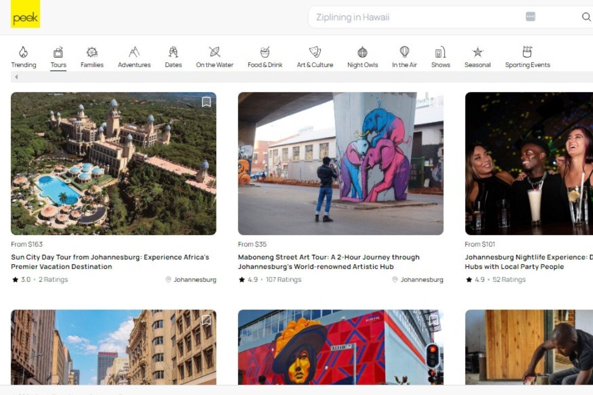
Winning Feature: Local Tours and Cultural Experiences
Boasting a user-centric design, Peek’s website offers a range of activities and personalised tours. The website design is straightforward, showcasing tours that can easily be filtered by activity types, like food and drinks, water-based, to arts and culture tours and excursions.
An unnoticeable yet innovative feature on the homepage is the toggle button to change the background colour between day and night mode. This web design element makes browsing through tours easier for the user, regardless of the time of day they’re browsing the site.

Peek stands out from other travel websites with its emphasis on local experiences, offering travellers authentic and personalised adventures. Each tour has an extensive gallery of high-quality images, a description, reviews, a price, a calendar, and an interactive map.
If you admire Peek’s user interface, you can easily access its web designs by registering for PeekPro. This allows you to integrate their equipment rental, tour operator, or online booking software with your own travel site, making Peek popular with local tour providers worldwide.
4. Get Your Guide
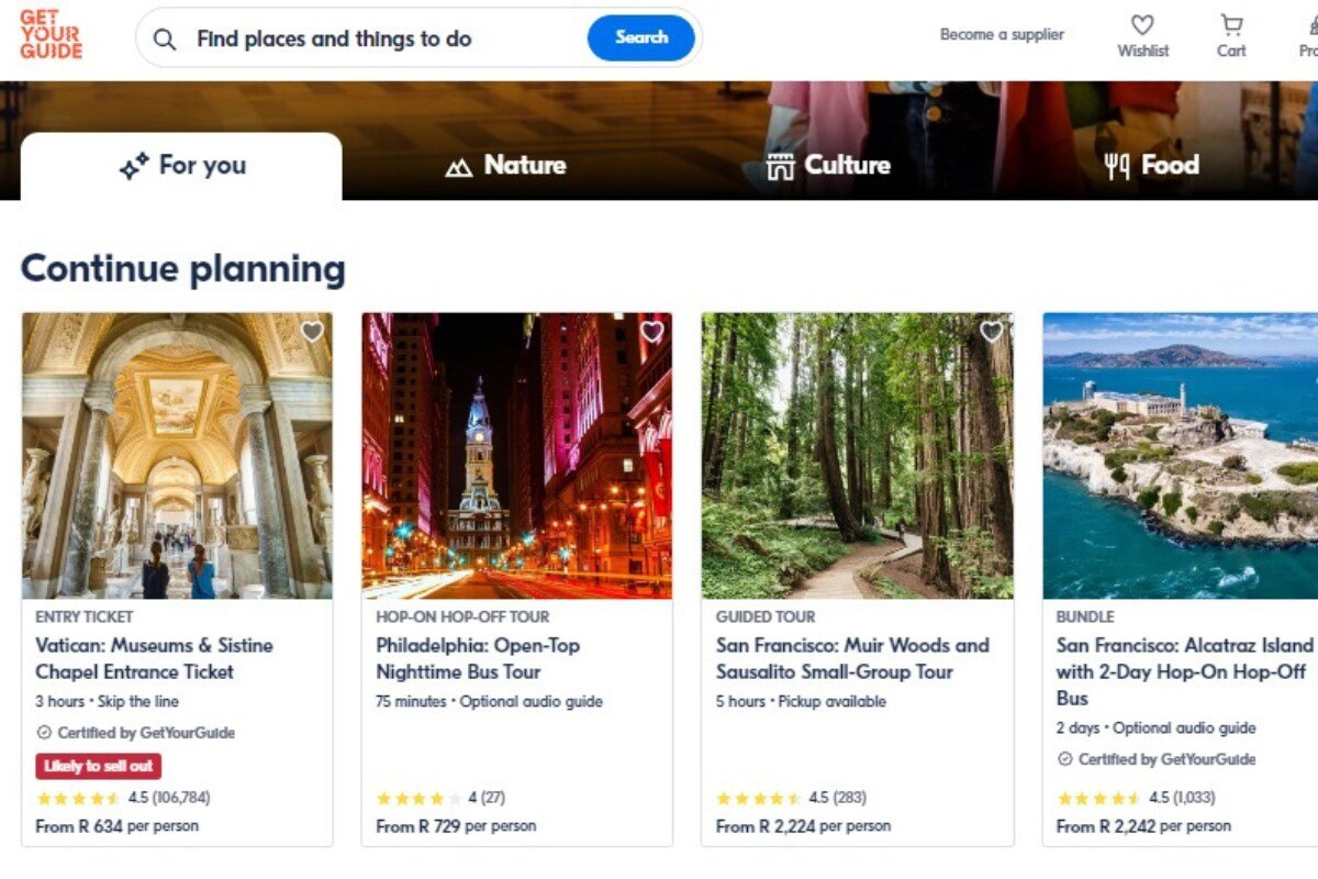
Winning Feature: Mobile-Friendliness and App Integration
Featuring an intuitive platform for discovering and booking tours, Get Your Guide offers visitors a clean website design with plenty of white space that makes tours pop. The homepage has filters by adventure, from food to nature, culture, and sporting events.
Get Your Guide has a responsive web design, making it very mobile-friendly. You can even download an app on Google Play or the App Store. The website design also allows you to see tours in-depth, from wheelchair accessibility to meeting points and customer reviews.
As a high-traffic travel website, Get Your Guide has many language and currency options, various payment systems, and affiliate or commission rewards for creators and operators. This makes Get Your Guide one of the best travel website designs, as it seamlessly streamlines the booking and payment processes.
5. Intrepid

Winning Feature: Live Chat Assistant
Connecting travellers from all walks of life since 1989, Intrepid is a travel company offering guided adventure tours all over the globe. Their modern design uses white space and beautiful imagery to draw attention to the excursions, making the site a breeze to browse.
Intrepid’s homepage features a search bar at the top, which allows website visitors to quickly search for excursions suitable for them. It also showcases tour options in terms of “ways to travel”; these range from cruises and cycling to walking and trekking and multi-day trips.
We really like the “Live Chat” feature. It’s one of the most important interactive elements that travel website designs must have, as it allows visitors swiftly to ask questions or seek clarity on tours. It also collects user names and email addresses, allowing Intrepid to follow up.
6. Cape Town Tourism

Winning Feature: Accessibility Feature
As one of South Africa’s three capitals, Cape Town is a world-class city that attracts visitors from all over the globe. So it’s only fitting that the city has its own travel site for the best tours and excursions in the Mother City — the website design is also something to rave about.
Boasting stunning visuals, intuitive navigation, and interactive maps in the tour details, the Cape Town Tourism website design is a well-oiled machine. This travel publication displays different destinations in and around the city, as well as various areas to stay.
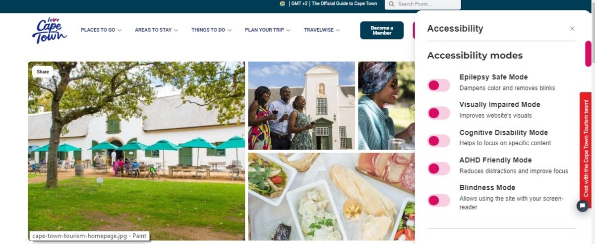
This travel website design checks all of the boxes for easy navigation, but our favourite feature has to be the “Accessibility Button.” The round button is represented by a white person figure against a pink background. It allows visitors to filter tours by physical and psychological accessibility, like epilepsy, visual impairment, cognitive disability, and ADHD.
Since the company is based on a single destination, the travel website design has numerous pages dedicated to sharing valuable information, such as “Safety in Cape Town.” Website visitors will find emergency contacts and FAQs about medical insurance and loadshedding.
7. With Locals
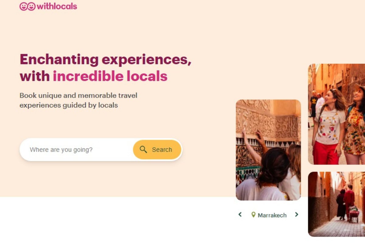
Winning Feature: Local Guides
Tailored for travellers looking to connect with locals, this travel website is perfect for tourists seeking authentic experiences at their destination of choice. The website design is simple and straightforward, highlighting the most popular things to do and tours across the world.
On the homepage, visitors will find tours filtered by different types of excursions, from walking to food, family, and night tours. Many travel website designs have this feature, but the sheer number of options makes With Locals outstanding.
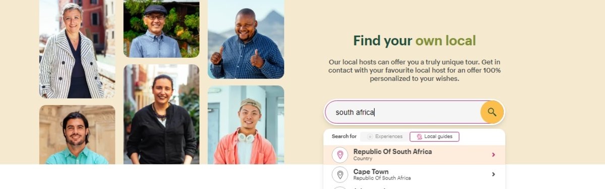
We love that this travel website focuses on connecting travellers with locals. They play a significant role in customising experiences for tourists with differing preferences. Finding a local guide ensures a truly authentic experience for travellers, so that’s a big win for us.
8. Traveling in Spain
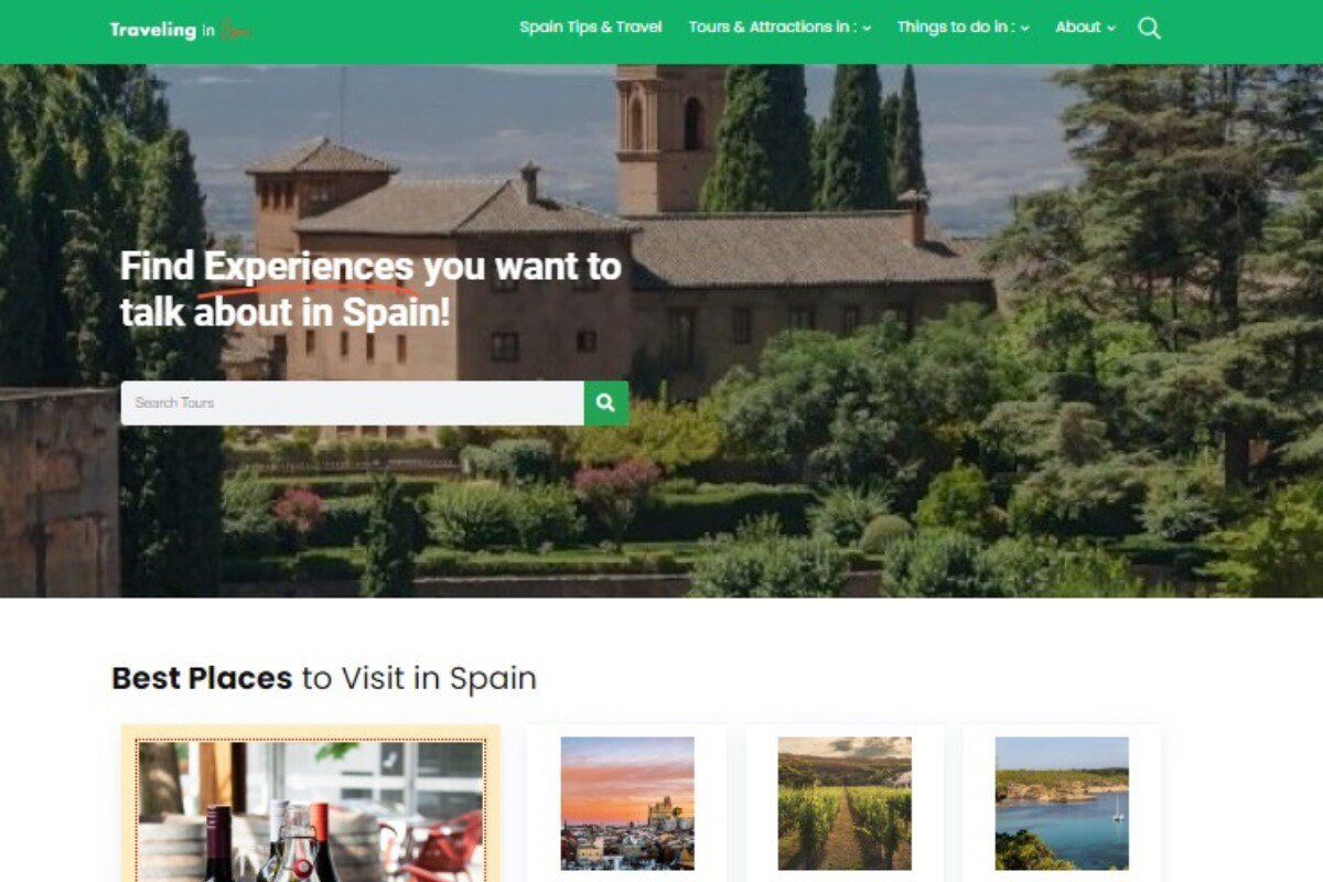
Winning Feature: Comparing Tours
As mentioned before, we are website design experts, and this next travel site proves that. Traveling in Spain is a destination-based website zoning in on tours of the Iberian country. This travel website design features a search bar, top tours, and travel tips on the homepage.
Traveling in Spain’s website design is uncomplicated. Their offerings include travel tips, tours and attractions, and blogs on the best things to do in the country. Given that the website is about a single country, the in-depth content details things to do in a city for every month.
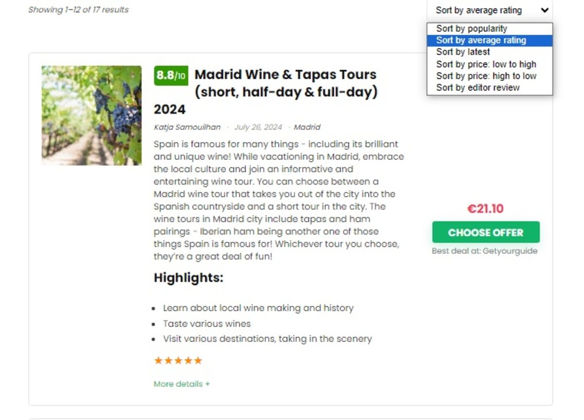
We designed the travel website so that visitors can see valuable insights into each tour at a glance. Potential customers will see a list of tours, including individual details such as price, description, and ratings from previous bookers.
Once visitors find the tour that interests them, they’ll see a rating out of 10, the best price for the tour, excursion highlights, and “things to know before booking.” Further down, they’ll find details about each tour, from operational times to inclusions and exclusions.
9. Expedia
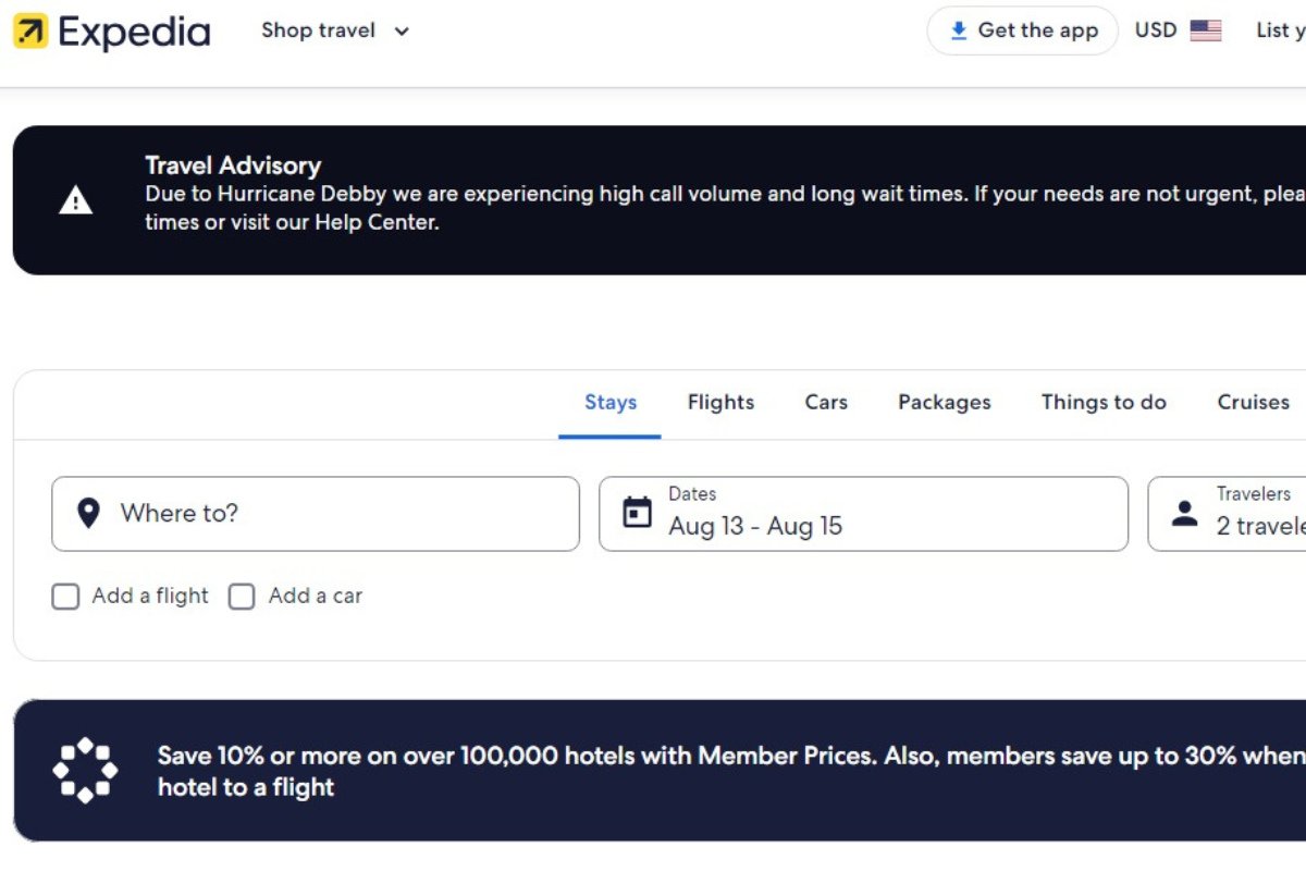
Winning Feature: Comparing Accommodations
If you’re looking for a travel website design with loads of accommodation options, Expedia should be at the top of your list. However, this website is not only for lodgings. It also provides access to flights, car rentals, cruises, and even package deals.
Expedia’s homepage is stacked with information. Visitors can find a search bar with filters for different travel services. It shows last-minute travel deals for those feeling spontaneous and a QR code to download the app for on-the-go browsing.
This booking website design does a great job displaying various accommodations and tours. Visitors can filter the options to meet their desires with features like price, neighbourhoods, payment types, property types, amenities, and accessibility.
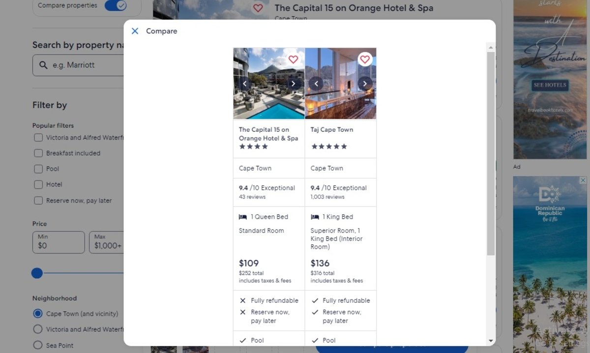
We like that Expedia’s website design allows potential customers to compare different accommodations. This gives a quick overview of two or more hotels, showing their star rating, reviews, prices, and amenities. For excursions, the website displays popular tours in each city, with their ratings, price per person, and the tour duration for pedantic travellers.
10. True North Adventure Cruises
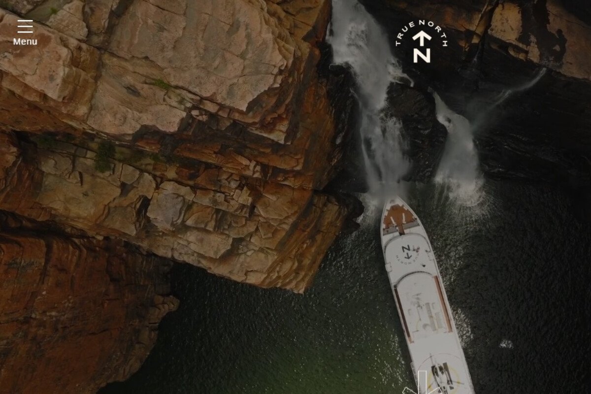
Winning Feature: Bold Imagery
Offering luxury cruises across Australia, True North offers exclusive tours that match its visually engaging website design. This website features a user-friendly design where users can scroll through cruise options and the different vessels.
Visitors will also find guest reviews, videos, podcast episodes, and even blog posts on the homepage. When browsing through this travel website, you’ll see that their images are big and bold. This adds to the overall appeal of the travel website design.

True North is a single destination website, the Land Down Under, which helps the website rank well on search engines for the keyword “cruises in Australia”. The website design works well for this kind of tour company as visitors already know the specific destination country.
The high-contrast design ensures that key elements stand out. We believe the standout feature is the bold imagery and visual contrast, which create a memorable and engaging experience. Finally, its clean design also enhances readability and navigation.
11. Trafalgar
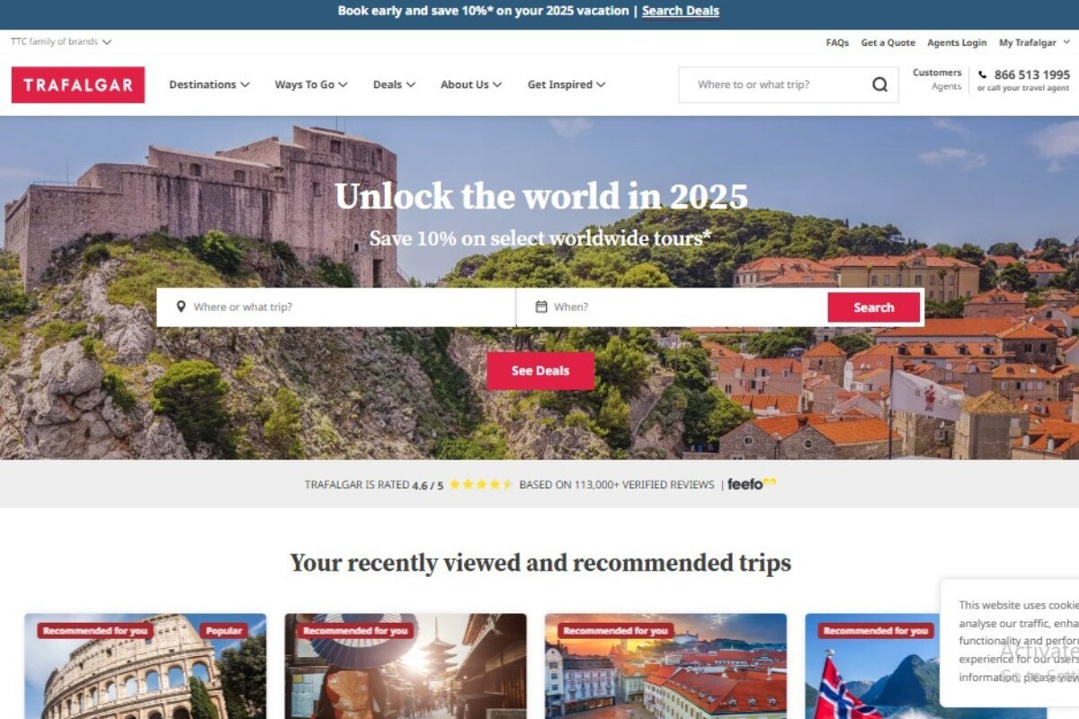
Winning Feature: Incentives for Repeat Bookings
As a world-class travel company, Trafalgar’s website offers a clear and straightforward approach to booking tours, focusing on user convenience and transparency. The travel website design shows visitors the most searched destinations and last-minute deals.
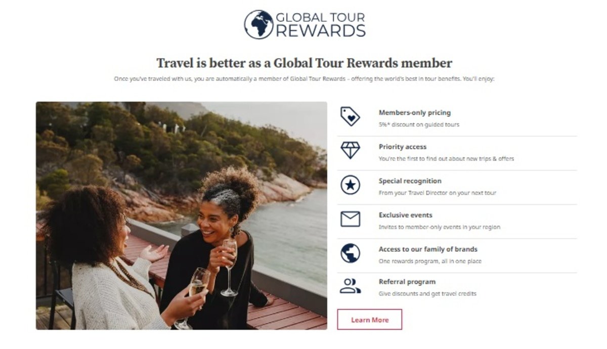
Trafalgar’s website design has travel blogs and FAQs on the homepage, allowing visitors to find as much information as they need on the first page. The website offers tour rewards, like a 5% discount on walking tours for members, priority access, and a referral program.
The website displays the company’s achievements in an “As Seen On” section. This acts as social proof for potential visitors and travel publications, as it shows trust and credibility. If you’re looking for design inspiration for your tour website, this is it.
Trafalgar’s website design is jam-packed with information, which may seem a bit untidy at times, but the value you get is worth it. We appreciate the rewards program, which offers incentives and encourages repeat bookings.
Trafalgar is a one-stop shop for all things travel. At the bottom of the homepage, visitors will find helpful information such as FAQs, travel updates, and booking conditions to help them plan and book for their ideal trip.
12. Tickets n Tour
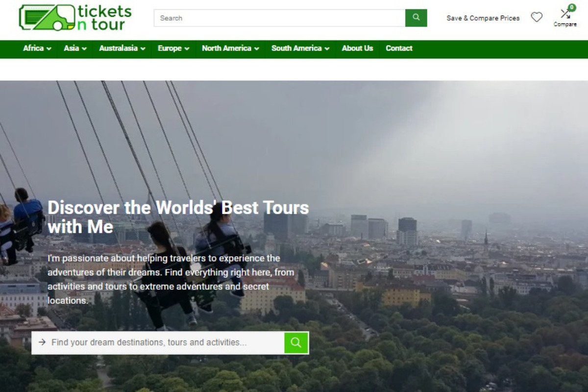
Winning Feature: Comparing Tours
Tickets n Tour integrates excursion information with user-friendly features, providing a detailed and engaging platform for discovering and booking tours. The website includes a robust search feature right at the top, an informative blog, and detailed tour ratings.
The travel website design features filters by continent, from Africa to Asia. If you take a closer look, the design further classifies tours by destinations, including their ratings, prices, and descriptions. Design inspirations don’t come this good, as Tickets n Tour allows for tour comparisons, which help users filter through different excursions based on their preferences.
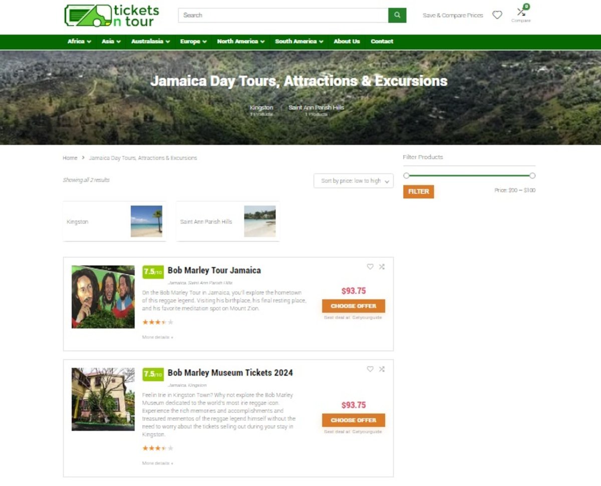
Other amazing features we identified on their travel website design include all the nooks and crannies of typical web designs, like top destinations, itineraries, and things to do. The website has social integration, so visitors can make contact via Facebook and Instagram.
13. Travel Local
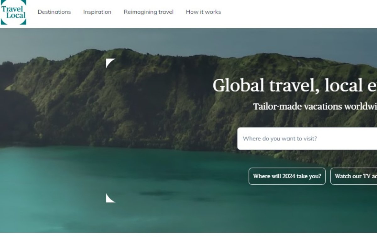
Winning Feature: Sustainable Travel
Travel Local focuses on providing an authentic and personalised travel experience through its specialised tours. The travel website design allows travellers to connect with local experts who will cater experiences tailored to their needs and wants.
Another aspect that makes this one of the best travel website designs is the focus on the locals. The homepage features a “How It Works” section which explains the company’s business structure and how it’s the best way for you to travel the world.

Travel Local offers visitors filters for types of travel. These range from winter escapes to underrated destinations, cycling, and multi-destination trips, as well as travel by train. This helps visitors minimise browsing, as it directs them to the specific type of tour they’re looking for.
We also like the website’s “Reimagining Travel” section, which explains the company’s core values and how it wishes to change the impact of travel. Travel Local highlights its work in sustainable travel as well as its commitment to net-zero travel by 2050.
What the Best Travel Website Designs Have In Common
Certain aspects of creating an amazing travel website design cannot be compromised. These critical elements not only improve the user experience but also foster trust and increase conversion rates.
Understanding what the finest travel website designs have in common will help you ensure that your site meets today’s traveller’s high expectations.
Here’s a breakdown of the key components that set these website designs apart.
Easy Navigation
The best travel website designs prioritise easy navigation, ensuring visitors can find what they need quickly and effortlessly. A well-organised menu structure, intuitive layout, and clear calls to action (CTAs) guide users through the website.
Easy navigation is essential because it reduces frustration, keeps visitors engaged, and ultimately leads to higher conversion rates. Whether someone is looking to book a tour, read a blog, or contact customer service, everything should be just a click away.
Immersive Imagery + Engaging Videos
High-quality visuals are a cornerstone of effective travel website design. Immersive imagery and engaging videos bring destinations to life, inspiring visitors and sparking their interest.
The best travel websites showcase their offerings using large, vivid photos and professionally shot videos. This visual storytelling not only captures attention but also provides a glimpse of the experiences that await.
Mobile-Friendly Modern Design
In today’s mobile-centric world, having a mobile-friendly design is critical, mainly because Google has announced mobile-friendliness as a core ranking factor. The best travel websites are entirely responsive, which means they look and work great on any platform, from smartphones to tablets to PCs.
A modern design that adjusts to different screen sizes ensures that website visitors have a consistent and pleasurable experience, regardless of how they visit the site. This is important for maintaining site visits and increasing reservations because some users may prefer reading about and booking tours on the go.
Search Bar
A search bar is a vital tool for any travel website design. It allows users to quickly find specific information, such as tours, destinations, or blog posts.
The best websites feature a search bar that’s easy to locate and use, often accompanied by filters to refine results. This functionality is especially important on content-rich websites, where visitors might be looking for very specific details.

Interactive Elements
Interactive elements, such as maps, quizzes, and sliders, engage visitors and make the browsing experience more dynamic. The best travel website designs incorporate these features to encourage exploration and make the content more engaging.
Social Media Integration
Social media integration is a key feature of successful travel website designs. By connecting with social media platforms like Facebook, Instagram, and YouTube, these sites allow users to share content, read reviews, and follow the brand on various channels. This integration not only increases brand visibility but also builds a strong community around the brand.
Visitor Reviews
Visitor reviews are essential for building trust and credibility. The best travel website designs prominently feature reviews from past customers, giving potential clients confidence in the services offered. These reviews often include ratings, photos, and detailed feedback, helping visitors make informed decisions.

Best Tour and Travel Website Designs | Summed Up
The best tour and travel website designs share common elements that enhance user experience and drive success. Easy navigation, immersive imagery, mobile-friendly design, and interactive features are just a few of the components that make these sites stand out.
By incorporating visitor reviews and integrating social media platforms into the site, your travel website can build trust and foster community.
For more insights and examples of outstanding travel website designs, check out this comprehensive travel agency website design guide.

Matt is a travel entrepreneur with over a decade of experience across digital marketing, operations, and asset investment. His ventures include founding the agency Travel Tractions, successfully buying and selling multiple travel websites, and owning a boutique hotel in his home base of Cape Town. His writing focuses on the intersection of data-driven marketing and real-world business growth in the tourism sector.